
Bento CMS 3.0
Role: User Experience & User Interface
Bento is the PBS created CMS system that helps stations and producers easily build websites. The team and I had been working to improve the modules and issues that existed with public facing interface, but there were technical issues that kept us from updating the CMS admin interface. The previous admin interface was form based and not intuitive, leading to a lot of user frustration; the team was ecstatic when we were given the green light for a redesign.

Creating a Live Edit Interface
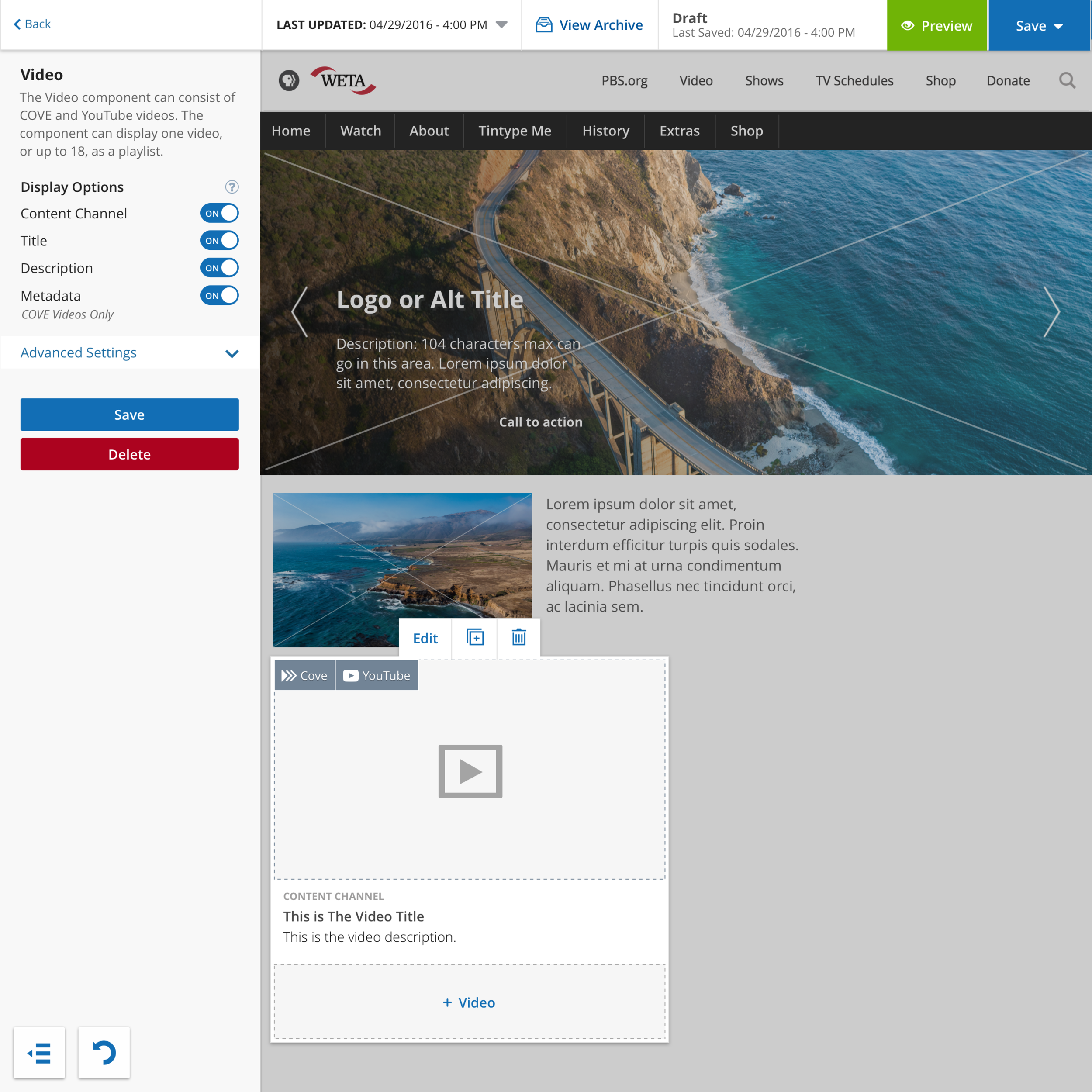
As a team, we knew we wanted to make the switch from a form based interface to a visual, live edit, interface. Our users wanted more flexibility with the CMS; we knew that by making the switch we could remove restrictions and excessive help text, because users could visualize their changes live. After many brainstorming sessions, rapid prototyping, and rounds of wireframes, we decided on a drag-and-drop solution that would allow live editing of text and layout. Page structure, metadata, and custom styles were all handled in a collapsible column to the left.

Brainstorming Sessions for Bento 3


Snapshot of updated component list
Modifying Existing Components
The existing Bento CMS was suffering from bloat. The UI of the previous admin limited the flexibility of components because every instance needed it’s own version. As a result, users had to scroll through a list of over 70 components. By stripping components to their basic functionality and breaking them into blocks that could build upon each other, I was able to cut our components by more than half. For example, instead of having multiple video components that served different purposes, I designed one video component that could be used as a single video with minimal information, or built into a full video playlist with all the video information displayed.
In addition, I designed a more visual experience for selecting components, so that they could be found and selected quickly. Although certain icons were obvious choices, there were a number if uncommon icons that needed to be created. Through iterations with team-members, we brainstormed icons that would best represent items like dfp ads, logos, tv listings, what's on and the various promos. Although the icons were accompanied by titles, we guerrilla tested them to make sure they were clear to both potentially new users and those who were familiar with the existing product.

Creating a User Friendly dashboard
The previous dashboard was a long list of links, where users had make multiple clicks to access information. There was little to no hierarchy to the list, and most users only used 3-4 of the options available. I wanted to create a dashboard that was clean, organized, and easy to navigate. The updated dashboard gave users necessary information up front. It is also flexible enough to add or subtract modules based on user permissions. In addition to the main page of the dashboard, the top navigation includes an easy way to access support, service notifications, and the user preferences.

